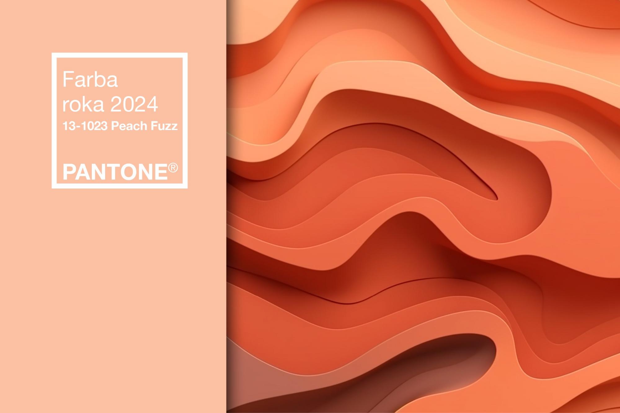
PANTONE 13-1023 Peach Fuzz expresses our desire to care for ourselves and others. It is a velvety soft peach note whose "spirit" enriches the mind, body and soul. Although it may seem poetic and romantic, with a certain amount of nostalgia and vintage atmosphere, the color of the year 2024 reflects the past, but also reflects the current zeitgeist.
Between pink and orange
Lee Eiseman Executive Director of the Pantone Color Institute™
"In search of a shade that reflects our innate desire for closeness and connection, we chose a color that radiates warmth and modern elegance. A shade that resonates with compassion, offers embrace and effortlessly blends the new, the young with the timeless,” said Lee Eiseman.
The peach shade of the current Color of the Year 2024 is delicately nestled between pink and orange. The color pink resembled the sunrise and was, for example, the color of upcoming success for the Chinese. Pink has a calming effect. It is bright and sweet, associated with femininity and love. Orange has in common with pink that it is bright and warm, but the difference is that it disturbs, activates, causes movement and joy. Orange stimulates the appetite and reduces fatigue. It is the color of energy, vitality and creativity.
PANTONE 13-1023 Peach Fuzz is a warm peach shade that evokes a feeling of kindness and tenderness. It brings a message of care and sharing, community building and collaboration. The shade represents a fresh approach to a new delicacy. PANTONE 13-1023 Peach Fuzz inspires belonging, rethinking thoughts and values, invites an atmosphere of calm and offers an environment to feel, heal and flourish. Thanks to comfort, it is possible to find peace from within, which affects our well-being. The color of 2024 awakens our senses to a soothing presence of tangibility and warmth.
The color of the year 2024 in office interiors
Yoga on the terrace. Own gym. Game zone. A corner for rest and relaxation. Fruit and muesli for breakfast. Did you come up with similar solutions for the phrase healthy office? However, the building itself and its parameters make a healthy space healthy. Finally, office buildings and spaces with certification have higher occupancy rates than those without. Do your employees know that you take care of enough sunlight, air exchange or low noise level? Do they know what well-being or biophilia is?
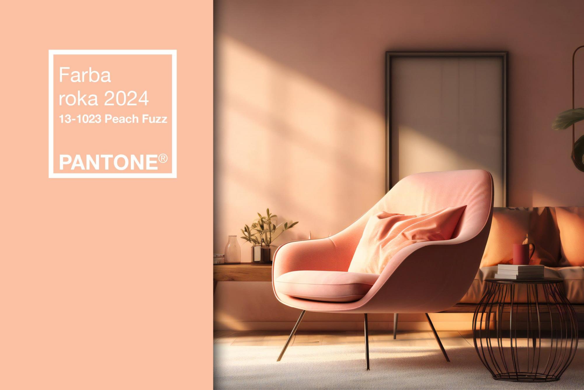
Sensitive, but sweet and airy. PANTONE 13-1023 Peach Fuzz evokes a new modernity. It connects pink, which in the interior of the space moves away, with orange, which, on the contrary, optically brings it closer. The warm and cozy shade of Peach Fuzz emphasizes our desire for togetherness. It emphasizes the enjoyment of moments of silence and creates a sense of refuge. It brings a fusion of human perception, concentration, mindfulness and the depth, lightness and austere beauty of the digital world. After almost a decade of the "millennial pink" trend and terracotta shades, Peach Fuzz is a pleasant refreshment.
Pastel peach color in the interior has many properties. The brighter the daylight falls on it, the more pleasant this shade is to the eye. However, if the room is dim, tones of blue or gray appear in peach. On the positive side, the peach color is suitable for rooms of almost all sizes and layouts and combines well with other colors and accessories. It is in combination with some shades of gray that it creates the impression of high-tech style. If there is too much peach on the wall, it can be muted by placing a contrasting picture. PANTONE 13-1023 Peach Fuzz just makes us instinctively want to reach out and touch it. The shade is therefore suitable for tangible objects that should touch and surround a person. We are talking, for example, about suede, velvet, quilted and furry textures that are soft, supple and soft to the touch. That is, about couches, sofas and chairs or pillows and beanbags. Peach color can therefore also be used for accessories that are supposed to soften austere and angular rooms.
Color for moments of relaxation
In a world that often emphasizes productivity and achievement, it is extremely important that we recognize the importance of rest and creativity. The color of the year 2024 encourages us to rebuild, recalibrate our priorities so that they are in line with our inner values. It means focusing on health and well-being, both mental and physical. It underlines what is important in life - warmth and comfort, spending time with friends and family or simply a moment for yourself. The color of the year 2024 expresses a warm and welcoming embrace, expresses a message of compassion and empathy. Therefore, it has something from the history of the Renaissance, but also a stamp of modernity.
Resources: Pantone, Alena Urlandová - Sila farby, EUROSTAV, 2016; icolorex.htgetrid.com